# Explore Apps
**Category:** Integrations/ExploreApps
## Design
### Description
Enable users to explore third-party apps that may provide additional business solutions for them.
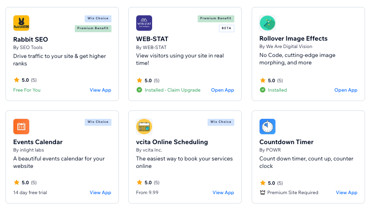
This is an integration with App Market’s solution, allowing users to explore and install apps while staying within context.
To get started, you need to have a tag in [Tags Manager](https://bo.wix.com/tag-manager/tags) and label the relevant apps that will be suggested to users from this entry point.
For any questions related to the Tags Manager, contact [#app-market](https://wix.slack.com/archives/C39SCMXDW).
Once you have created a tag, easily integrate it under the “More Actions” menu in your page. See the example below.
### Explore related apps
Let your users explore related apps via \`MoreActions\` component.
pass the explore apps modal props that will be render on user demand and we will take care of the rest.
To pass the necessary properties to the `MoreActions` component, use the following code:
```jsx
```
```tsx
import { Avatar, CustomModalLayout, Modal } from '@wix/design-system';
import React from 'react';
import {
Table,
useTableCollection,
MoreActions,
PrimaryActions,
} from '@wix/patterns';
import { CollectionPage } from '@wix/patterns/page';
import { InvoiceSmall, VisibleSmall } from '@wix/wix-ui-icons-common';
import { contacts } from '@wix/crm';
import { ModuleRegistry } from 'react-module-container';
function ExploreApps() {
React.useState(() => {
// Mock explore apps modal, cause its unsupported in storybook env
ModuleRegistry.registerComponent(
'in-context-apps-modal',
() =>
({ isOpen, title, subTitle, onClose }: any) => {
return (
);
},
);
});
const state = useTableCollection({
queryName: 'contacts-ExploreApps',
itemName: (contact) =>
`${contact.info?.name?.first} ${contact.info?.name?.last}`,
fetchData: (query) => {
const { limit, offset, search } = query;
let queryBuilder = contacts.queryContacts().limit(limit).skip(offset);
if (search) {
queryBuilder = queryBuilder.startsWith('info.name.first', search);
}
return queryBuilder.find().then(({ items = [], totalCount: total }) => ({
items,
total,
}));
},
fetchErrorMessage: () => 'Error fetching contacts',
filters: {},
});
return (
console.log('I do something')}
/>
}
moreActions={
,
onClick: () => {
console.log('Action #1');
},
},
{
text: 'Another Action #2',
prefixIcon: ,
onClick: () => {
console.log('Action #2');
},
},
],
]}
exploreAppsModalProps={{
title: 'Explore Apps',
subtitle: 'Find the right app for your business',
tag: '7d4d7891-2995-4bb9-8d2b-457aa7dca3f2',
}}
/>
}
/>
(
),
},
{
id: 'name',
title: 'Name',
width: '250px',
render: (contact) =>
`${contact.info?.name?.first} ${contact.info?.name?.last}`,
},
]}
/>
);
}
```
## API
### Props
| Prop | Type | Required | Default | Description |
|------|------|----------|---------|-------------|
| `items` | `MoreActionsPropItem[] \| MoreActionsPropItem[][]` | No | - | Actions items that appear in the `MoreActions` popover menu. \ Actions can be grouped by using an array of arrays. \ Each sub-array represents a different group within the popover, \ and a divider will be rendered after each sub-array to separate the groups. \| [MoreActionsItem](./?path=/story/common-types--moreactionsitem)[][] |
| `containerId` | `string` | No | - | An id of the container defined in the installed on a site application that contains TPA's actions. |
| `containerProps` | `Record` | No | - | Additional properties passed to the `onClick` of the container's extensions menu items. |
| `biAdditionalInfo` | `string` | No | - | Additional info for cairoPageCtaClicked BI event. |
| `triggerElement` | `ReactNode \| FC` | Yes | - | Defines a component that calls out a Popover menu (``, `` or ``) |